

Using Sample Data: The examples on this page use fields from our sample dataset. Download it and create an evaluation with it to follow along with this tutorial.
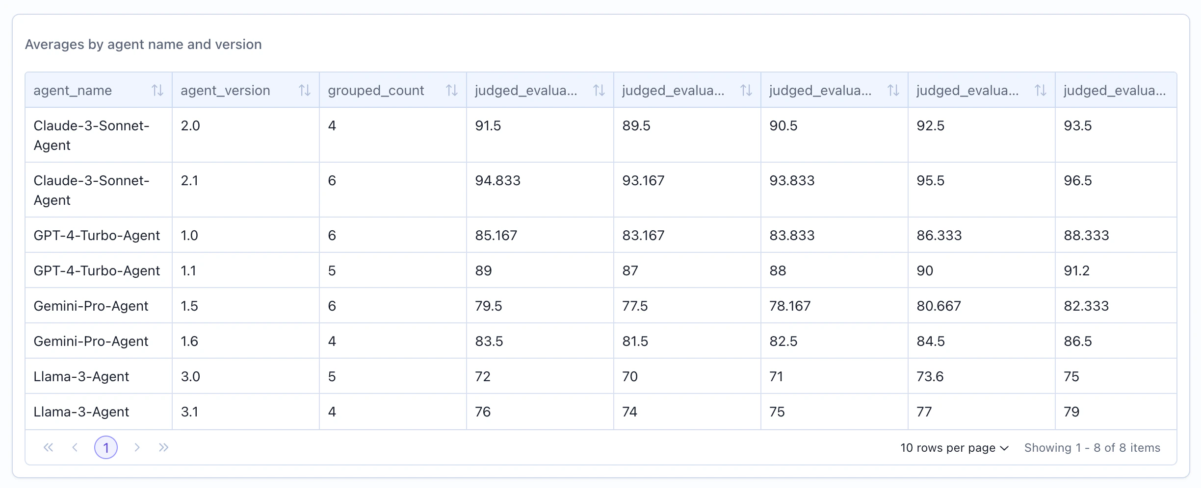
When to Use
Use table widgets to:- Show detailed breakdowns by multiple dimensions
- Display ranked lists (top/bottom performers)
- Present multi-column statistical summaries
- Create export-friendly data views
- Compare metrics across categories
- Show individual item details
Configuration
Required Fields
string
required
Widget display name shown on the dashboard
string
required
Must be set to “table”
object
required
SeriesQuery returning multiple rows
Query Requirements
Table widgets require a SeriesQuery with:- At least one item in the
selectclause - Can mix
COLUMNandAGGREGATIONexpressions - Supports
filterfor row filtering - Supports
groupByfor dimensional breakdowns - Supports
limitfor top-N results
When using
groupBy, all non-aggregated columns in select must appear in the groupBy array.Creating in the UI
1
Open Widget Creator
From your dashboard, click “Add Widget” and select “Table”
2
Turn off Grouping (Optional)
Decide whether to group by columns or not by toggling the “Group By” toggle. If you turn off grouping, you will not be able to aggregate data.
When grouping is turned on, we will automatically output the count of the group.
3
Select Columns
If aggregating, specify which columns to group by, if not grouping select the columns you want to display.
4
Enter Title
Give your table a descriptive name (e.g., “Average Scores by Agent”)
5
Add Aggregations (Optional)
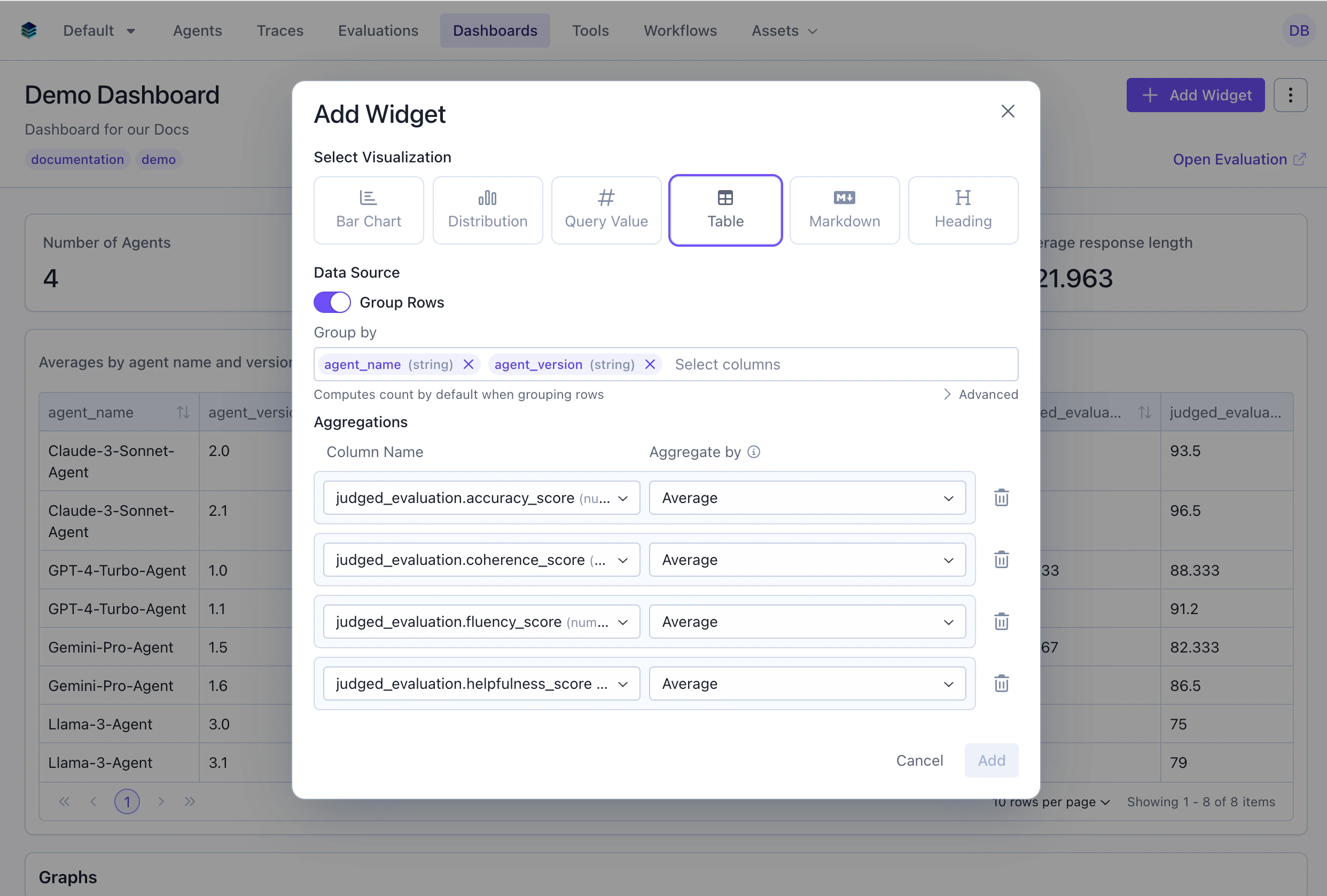
- Columns: Select fields from your data
- Aggregations: Add computed metrics (AVG, COUNT, etc.)
6
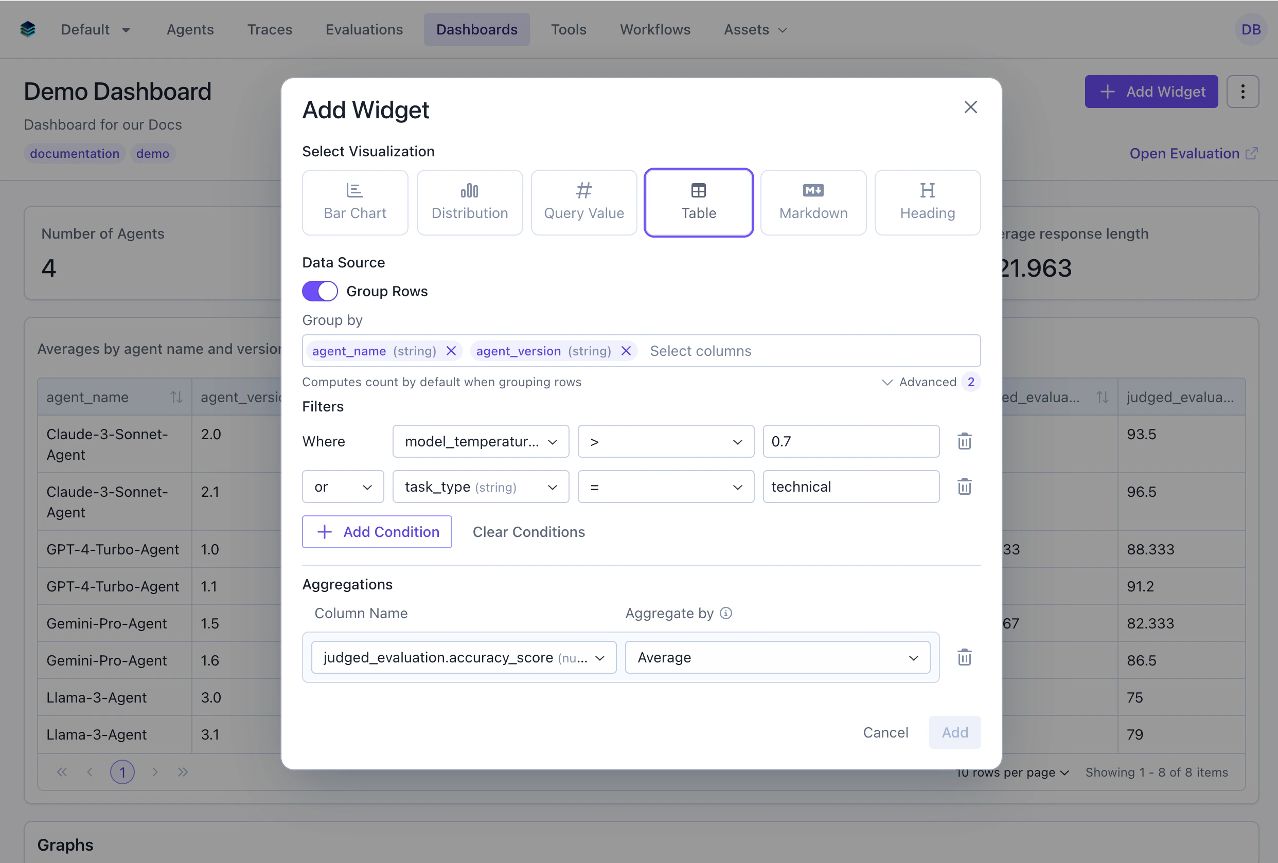
Add Filters (Optional)
7
Create Widget
Click “Add” to display the table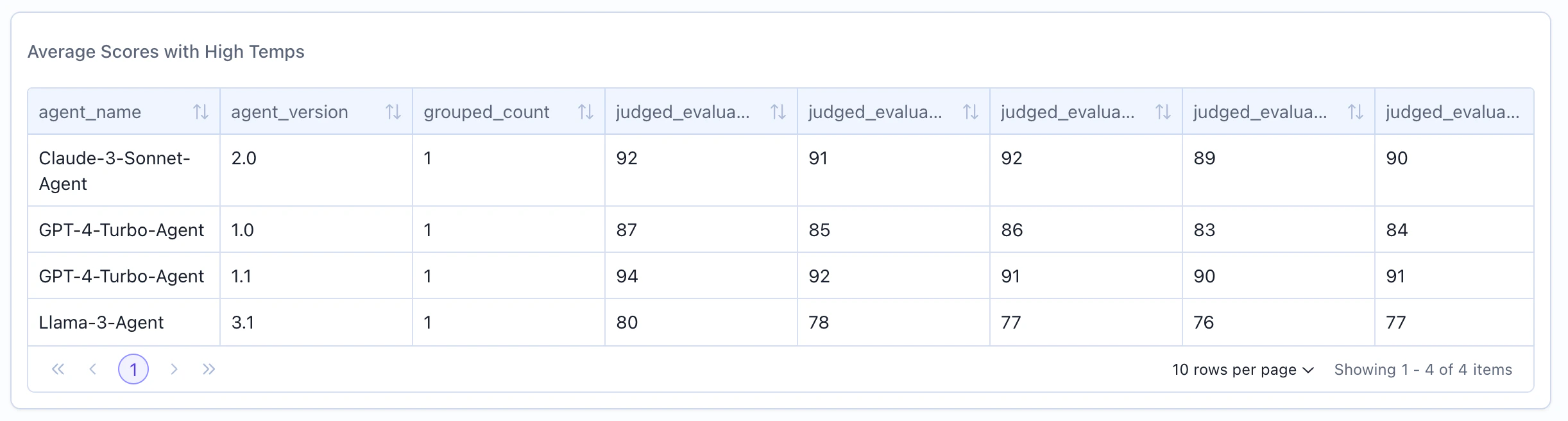
Conditional Formatting
Apply color-coded formatting rules to table cells to highlight important values at a glance. Conditional formatting is available on grouped tables (tables with aggregations).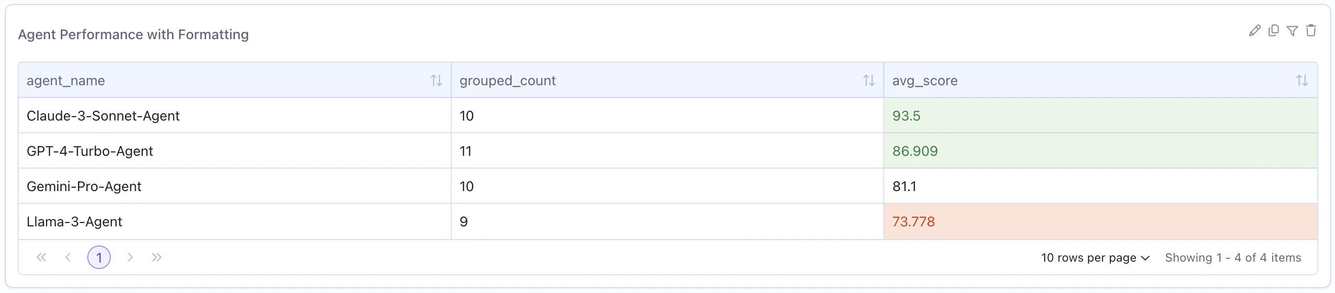
Enabling in the UI
When creating or editing a grouped table widget, expand the “Formatting” section to add rules. Select the aggregation column to format, choose a rule type, and pick a color.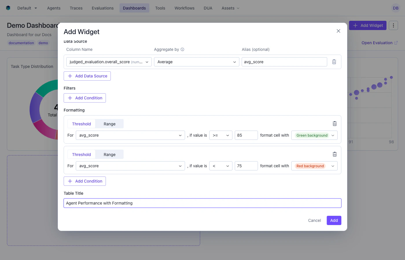
Rule Types
Threshold Rules
Apply formatting when a cell value meets a comparison condition.Range Rules
Apply formatting when a cell value falls within a range (inclusive).SDK Example
Formatting Behavior
- Rules are evaluated in order — the first matching rule wins
- Only applies to aggregation columns in grouped tables
- Available colors:
green,yellow,red,purple,blue - For percentage columns, formatting comparisons use the display value (0-100), not the raw decimal (0-1)
Output Format
Table widgets return an array of row objects:data array represents one row, with keys corresponding to column names.
Example Use Cases
Use Case 1: Agent Performance Breakdown
Show statistics grouped by agent with multiple metrics.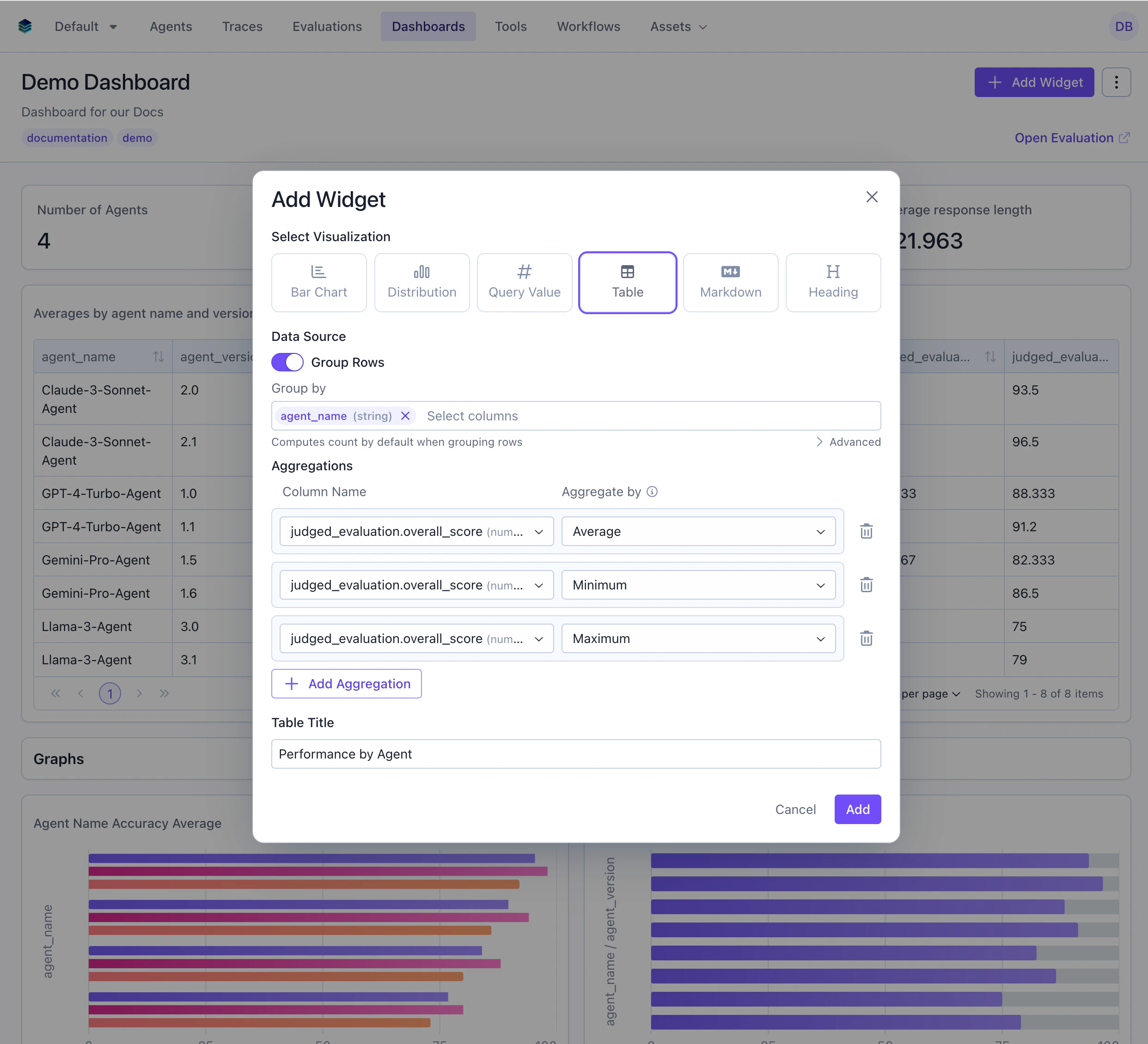
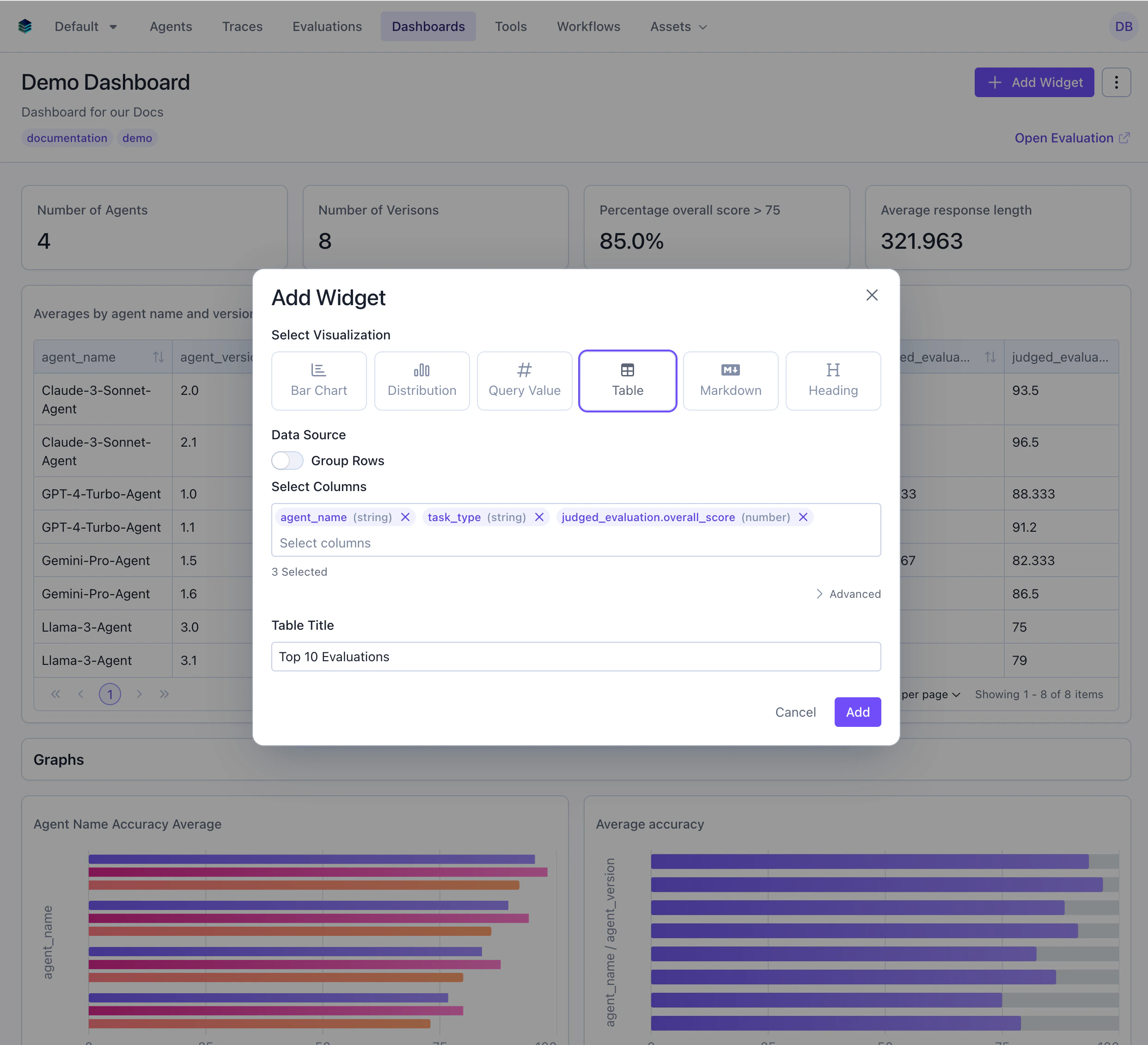
Use Case 2: Top 10 Highest-Scoring Evaluations
Display the best-performing individual evaluations without aggregation.In the UI sort using the table header, this will not be reflected in the query.
Use Case 3: Agent Comparison with Multiple Metrics
Compare agents across several statistical measures including accuracy and relevance.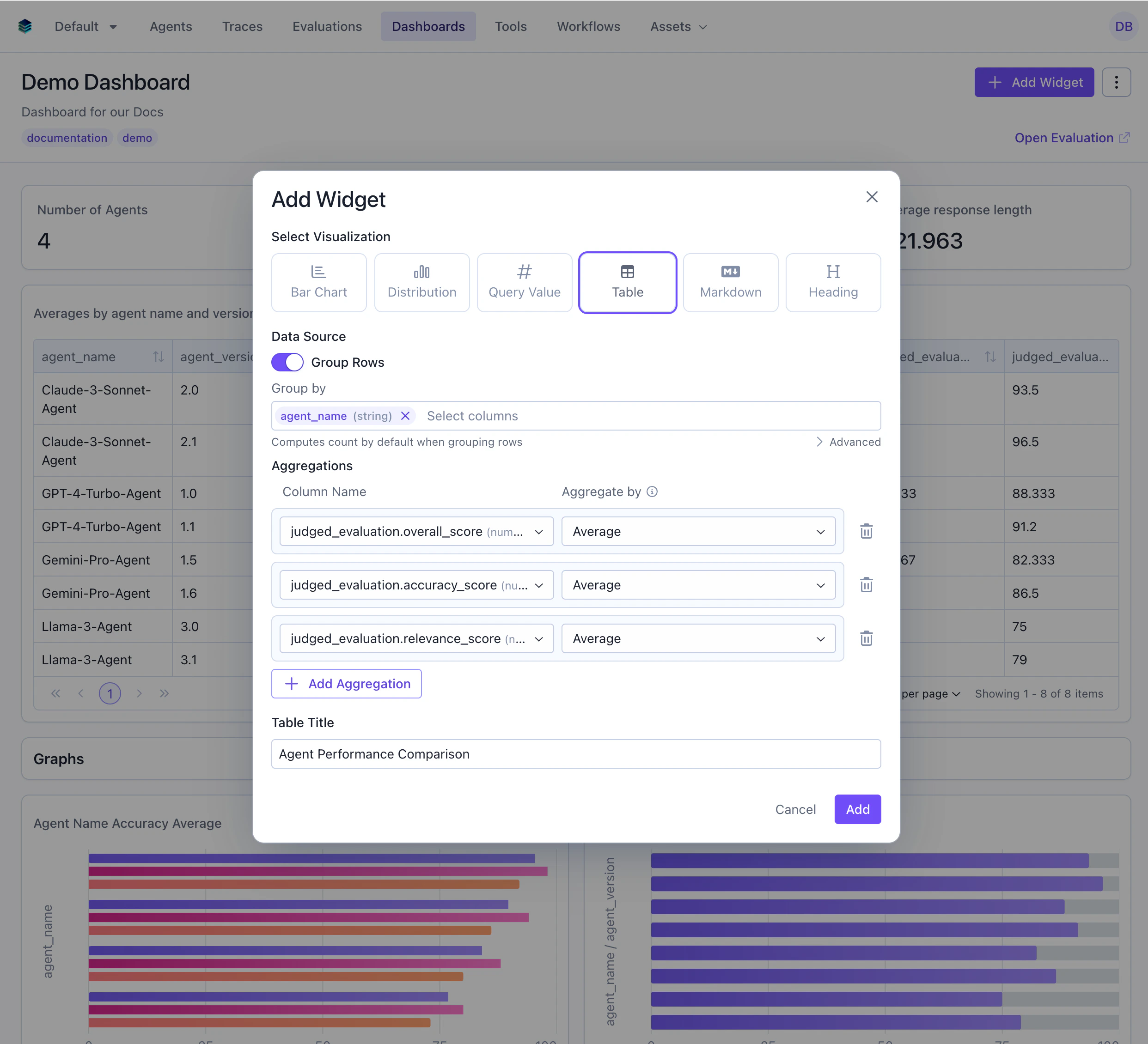
Use Case 4: Low-Scoring Evaluations Review
Show evaluations scoring below 80 that need attention.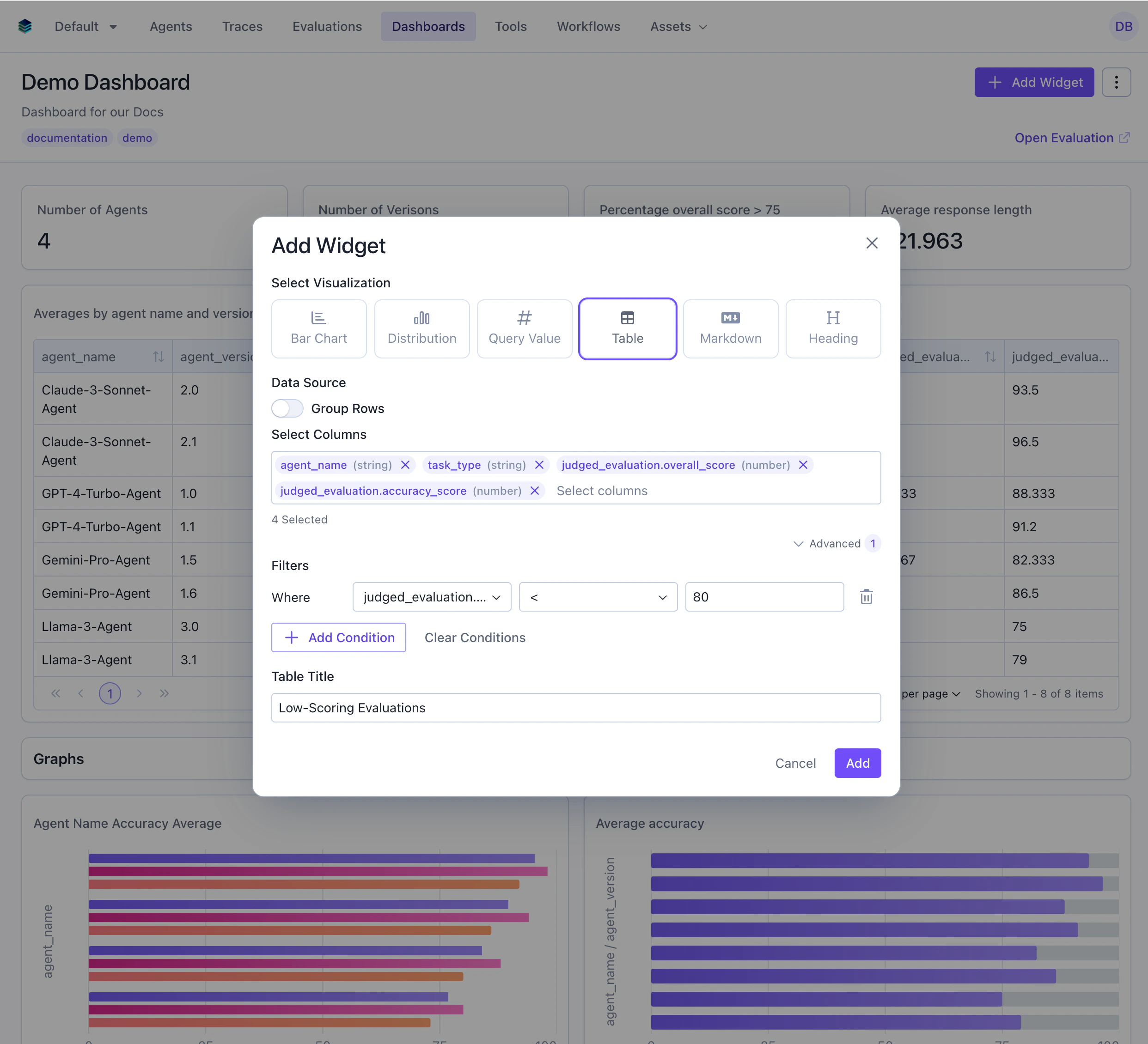
Related Documentation
- Query Language Reference -
GROUP BYandORDER BYsyntax - Bar Chart Widget - Visual alternative to tables
- Metric Widget - For single-value displays
- API Reference - Programmatic table creation