Using Sample Data: The examples on this page use fields from our sample dataset. Download it and create an evaluation with it to follow along with this tutorial.
When to Use
Use bar chart widgets to:- Compare values across categories or groups
- Show rankings or relative performance
- Visualize aggregated metrics by dimension
- Make patterns and outliers immediately visible
Configuration
Required Fields
string
required
Widget display name shown on the dashboard
string
required
Must be set to “bar”
object
required
SeriesQuery with
GROUP BY for categorical breakdownX-Axis Configuration (One Required)
You must provide eitherx_column or x_column_group, but not both:
string
Single column name to use for x-axis categories. Use for simple bar charts grouping by one dimension.Example:
"agent_name" - creates bars for each agentstring[]
Array of column names for multi-dimensional grouping. Use for complex bar charts that group by multiple dimensions.Example:
["agent_name", "task_type"] - creates grouped bars combining agent and task typeOptional Config Fields
boolean
default:"true"
Controls whether multiple series are stacked or displayed side-by-side.
true(default): Stack bars on top of each other (useful for showing totals)false: Display bars side-by-side (better for comparing individual values)
boolean
default:"false"
When
true, each bar’s value is rendered directly on the chart so you don’t have to hover to read it.Value labels apply to single-series charts only (charts with one aggregation). They are ignored on multi-series charts, which use a legend instead.Query Requirements
Bar chart widgets require a SeriesQuery with:groupByfor categorical breakdown (required)- Should have at least one aggregation for y-axis values
- Can include
filterfor row filtering
Creating in the UI
1
Open Widget Creator
From your dashboard, click “Add Widget” and select “Bar Chart”
2
Enter Title
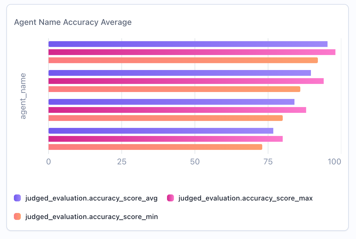
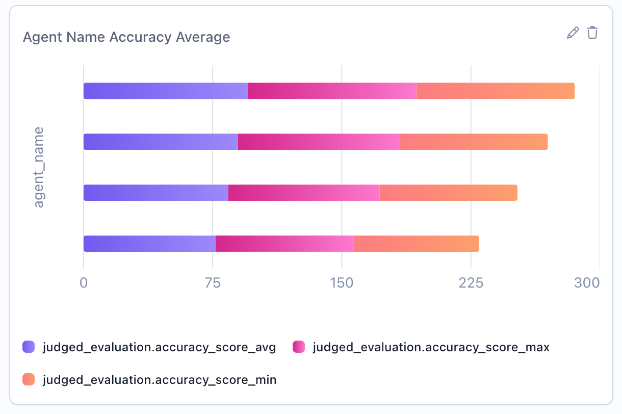
Give your chart a descriptive name (e.g., “Agent Name Accuracy Average”)
3
Configure Query
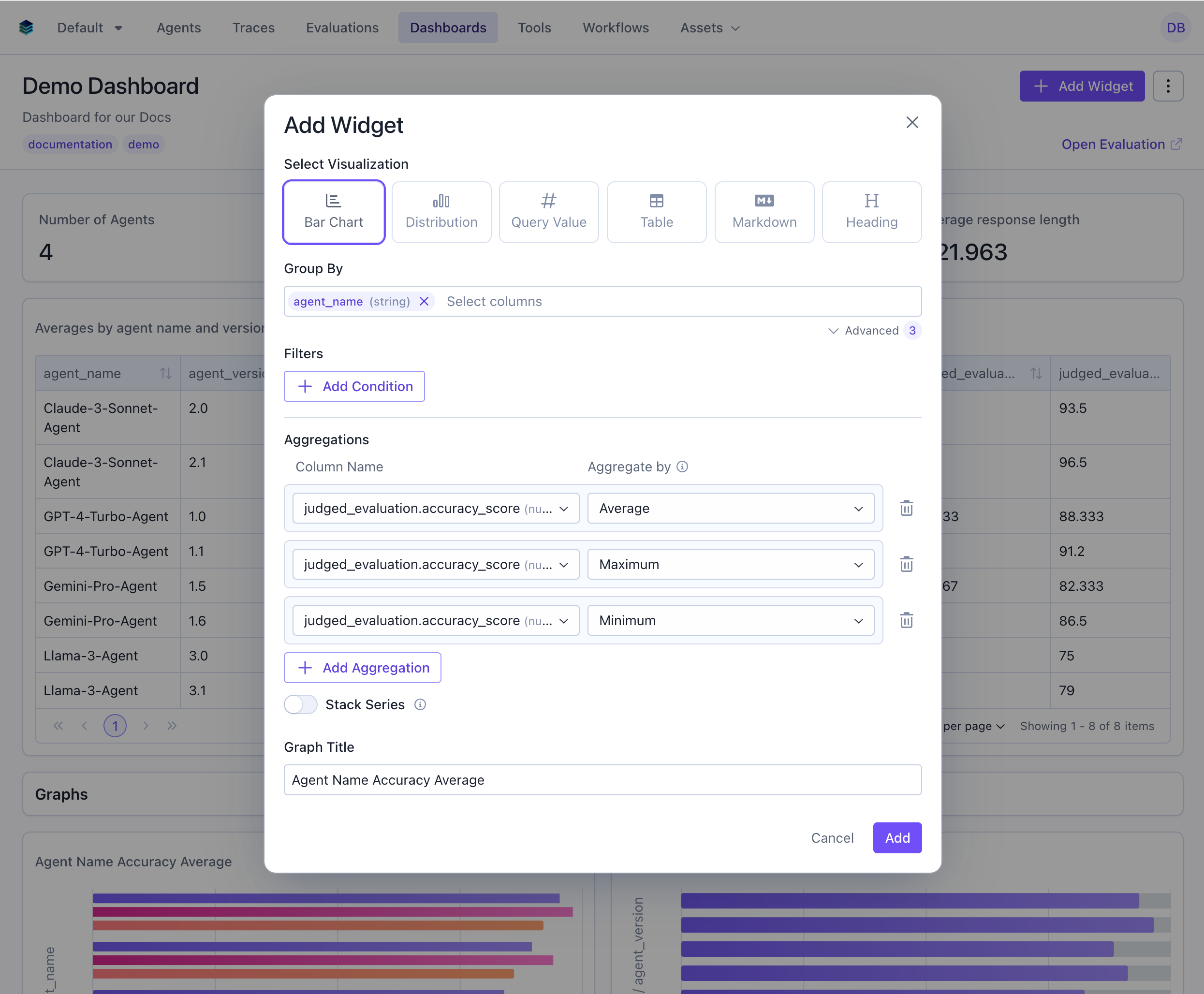
- Group By: Select the categorical dimension - these will be the bars on the y-axis
- Aggregation: Choose the metric to visualize (
AVG,SUM,COUNT) - Filter: Add conditions to narrow the data (optional)
4
Show Values on Bars (Optional)
For single-series charts, toggle Show values on bars to render each bar’s value directly on the chart. This sets
config.show_value_labels.5
Create Widget
Click “Add” to generate the bar chart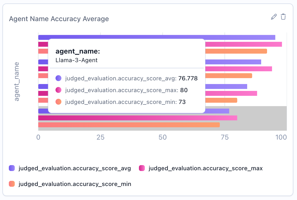
Output Format
Bar chart widgets use the same series format as tables:Example Use Cases
Use Case 1: Average Score by Agent
Compare performance across different agents.
Use Case 2: Evaluation Count by Task Type
Show which task types have the most evaluations.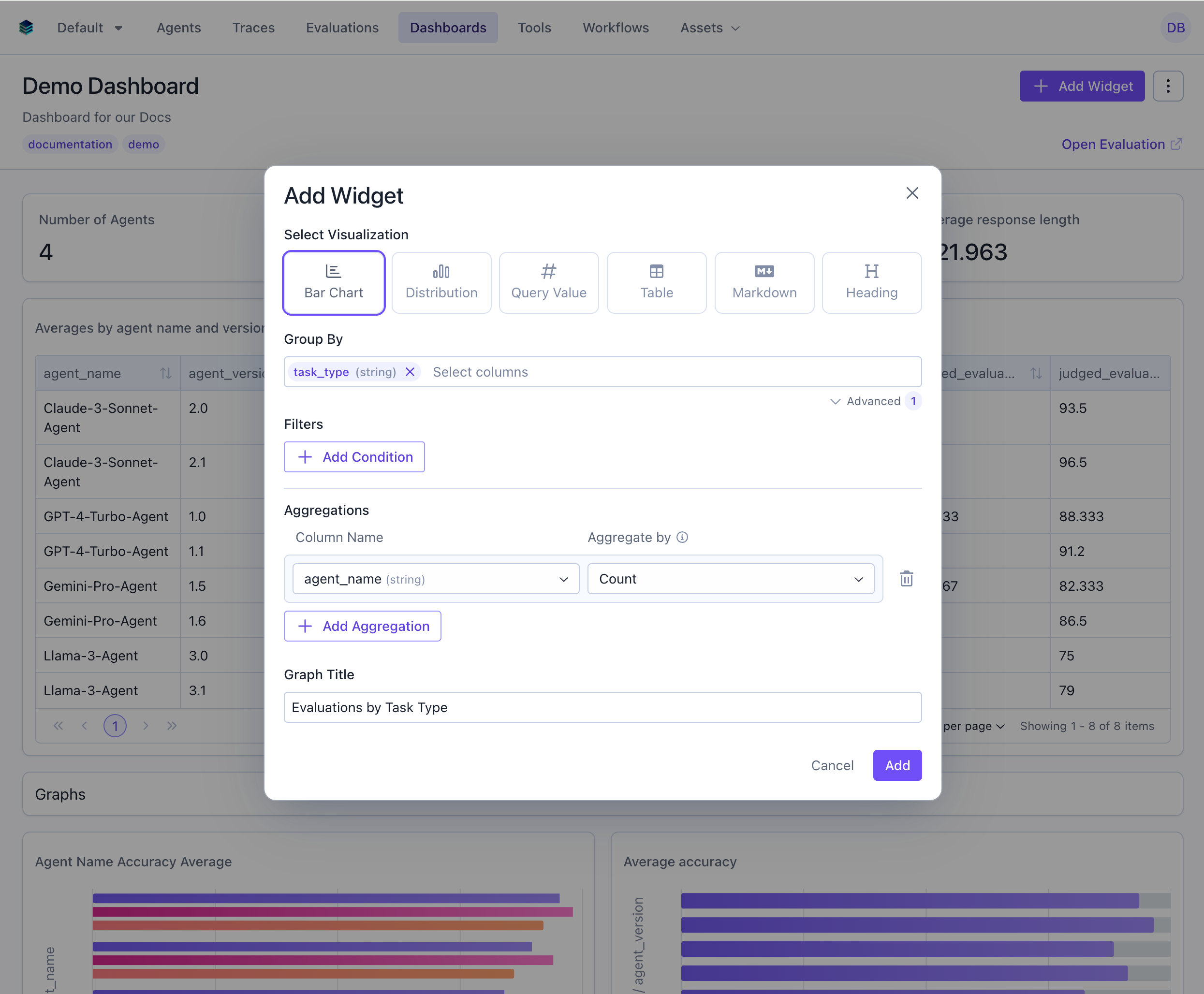
Use Case 3: High Performance Rate by Agent
Visualize percentage of evaluations scoring 85+ across agents.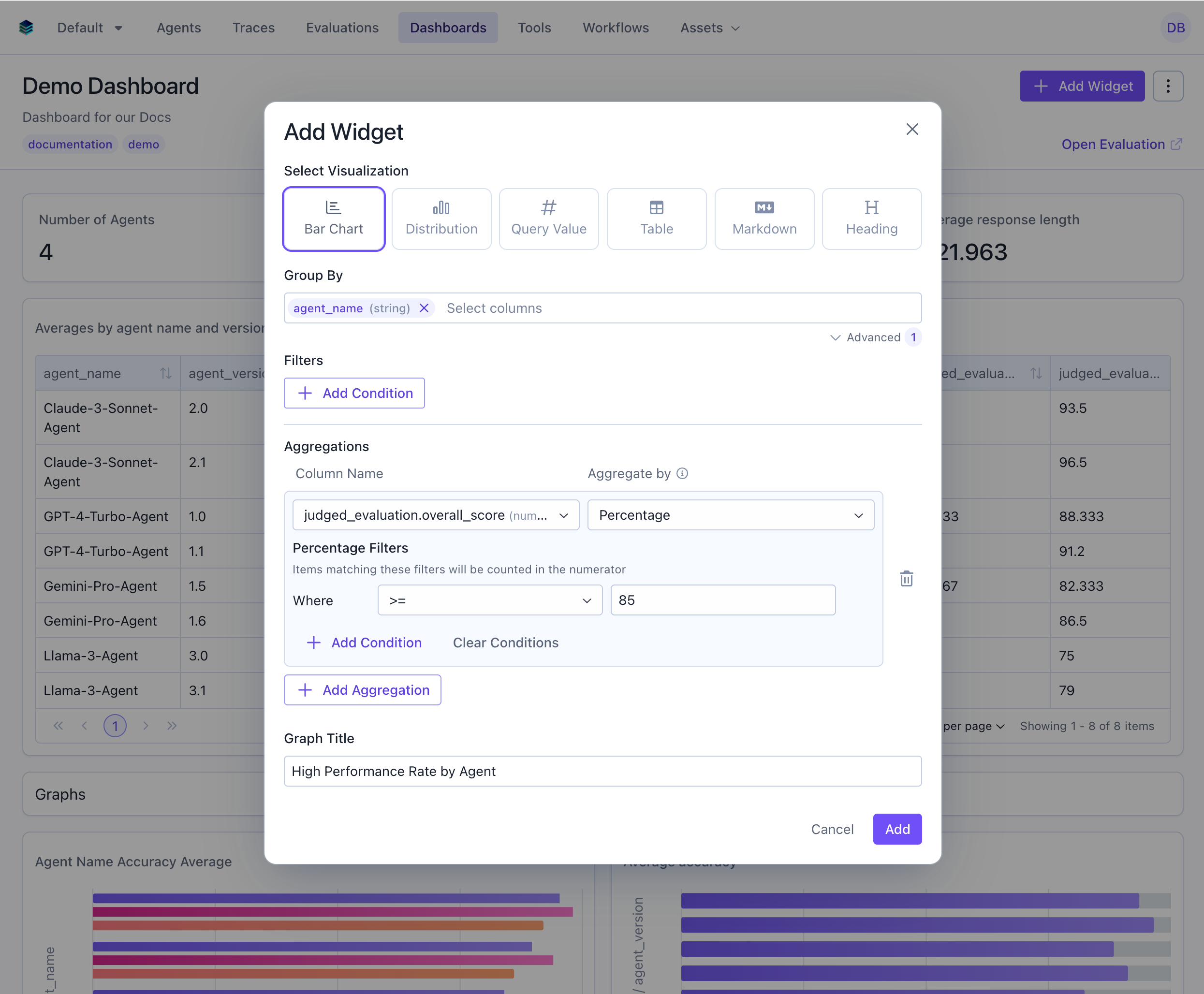
Use Case 4: Multi-Dimensional Grouping with x_column_group
Group by multiple dimensions to create side-by-side bar comparisons. This example shows average scores grouped by both agent and task type.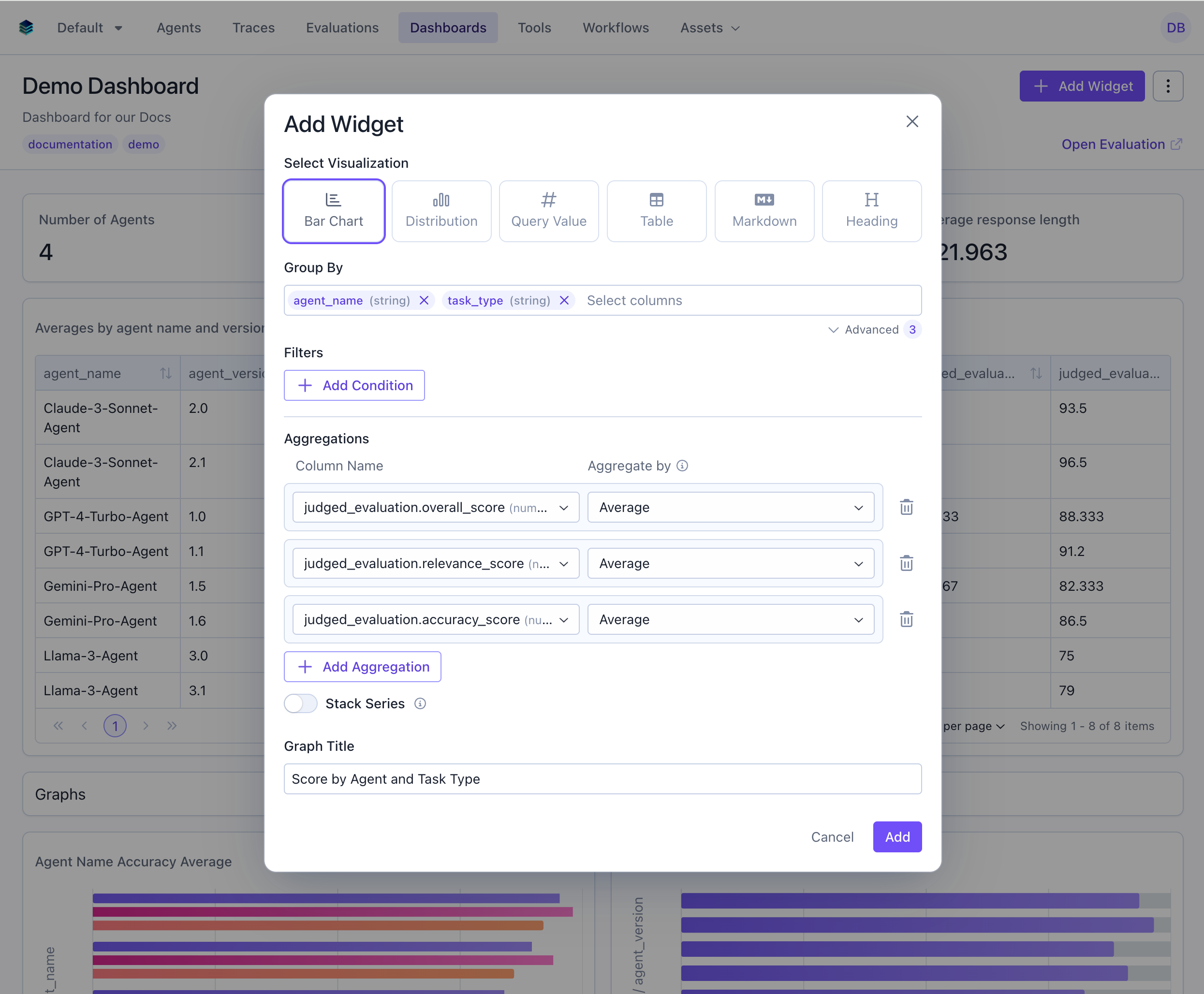
Stacked vs Unstacked Series
When you have multiple series (e.g., multiple aggregations or groupings), you can control how they’re displayed:Stacked Bars (Default)
- Showing part-to-whole relationships
- Comparing total values across categories
- Visualizing composition over categories
Unstacked Bars (Side-by-Side)
- Comparing individual series values directly
- When exact values matter more than totals
- Multi-dimensional analysis (e.g., agent + task type)
Display Behavior
Bar charts apply the following formatting automatically. These behaviors are built into the rendering, so there are no extra config fields to set.Category labels
Category labels are shown next to each bar by default, so you can read values without hovering. Long labels are truncated to fit, and hovering a truncated label reveals its full text in a tooltip.Per-category colors
When a chart has a single series and more than one category (for example, anAVG grouped by agent_name), each bar is given a distinct color from a rotating palette. This makes individual categories easier to tell apart when there are many bars. Charts with multiple series keep one consistent color per series instead, so the series stay comparable across categories.
Humanized column names
Raw column names are converted to readable Title Case in axis labels, the legend, and tooltips (for example,experiment_param_value becomes “Experiment Param Value” and avgScore becomes “Avg Score”). Aliases that already contain spaces are shown unchanged, so you can override the displayed text by aliasing a column in your query.
Related Documentation
- Table Widget - Tabular alternative with more detail
- Histogram Widget - For numerical distributions
- Query Language -
GROUP BYand aggregation syntax - API Reference - Programmatic chart creation