> ## Documentation Index
> Fetch the complete documentation index at: https://docs.gp.scale.com/llms.txt
> Use this file to discover all available pages before exploring further.
# Scatter Plot Widget
> Visualize relationships between two numerical dimensions
**Using Sample Data**: The examples on this page use fields from our sample dataset. Download it and create an evaluation with it to follow along with this tutorial.
 ## When to Use
Use scatter plot widgets to:
* Explore correlations between two numerical metrics
* Identify outliers in multi-dimensional data
* Visualize X-Y relationships with optional bubble sizing
* Spot clusters or patterns across evaluation items
## Configuration
### Required Fields
Widget display name shown on the dashboard
Must be set to "scatter"
SeriesQuery selecting at least two numeric columns
### X-Axis Configuration (One Required)
You must provide **either** `x_column` **or** `x_column_group`, but not both:
Column name for the x-axis. Must be a numeric column.
**Example:** `"accuracy_score"` - plots accuracy on the x-axis
Array of column names for multi-dimensional grouping on the x-axis.
**Example:** `["agent_name", "accuracy_score"]`
### Query Requirements
Scatter plot widgets require a **SeriesQuery** with:
* At least two numeric columns selected (one for x-axis, one for y-axis)
* Optional `GROUP BY` for creating grouped scatter points
* When grouped, aggregations determine the plotted values and dot size scales dynamically based on the count
Dot sizes are dynamically scaled based on the aggregation value, with the maximum size determined by the largest value in the dataset.
## Creating in the UI
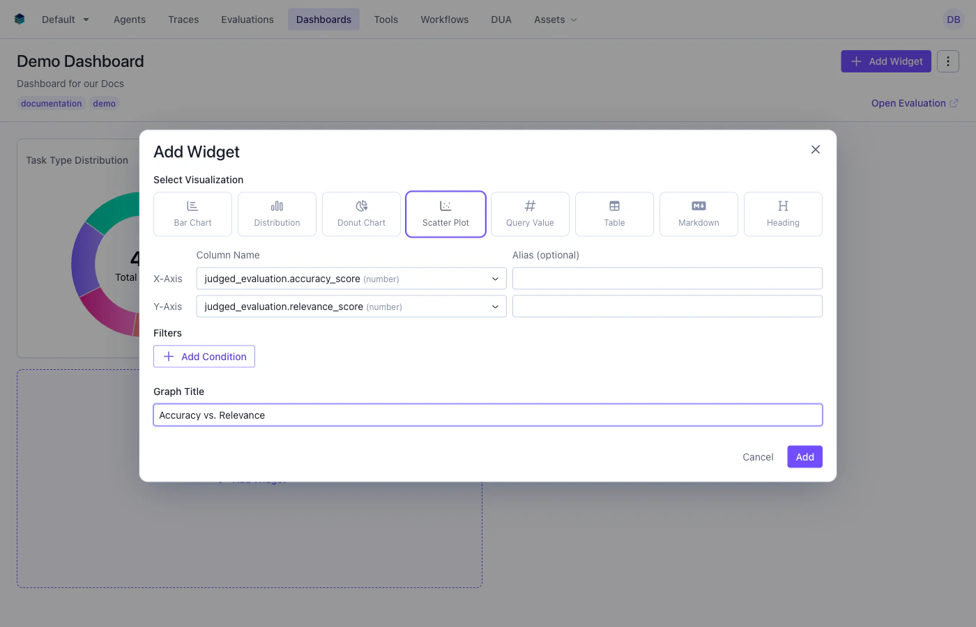
From your dashboard, click "Add Widget" and select "Scatter Plot"
Give your chart a descriptive name (e.g., "Accuracy vs. Relevance")
## When to Use
Use scatter plot widgets to:
* Explore correlations between two numerical metrics
* Identify outliers in multi-dimensional data
* Visualize X-Y relationships with optional bubble sizing
* Spot clusters or patterns across evaluation items
## Configuration
### Required Fields
Widget display name shown on the dashboard
Must be set to "scatter"
SeriesQuery selecting at least two numeric columns
### X-Axis Configuration (One Required)
You must provide **either** `x_column` **or** `x_column_group`, but not both:
Column name for the x-axis. Must be a numeric column.
**Example:** `"accuracy_score"` - plots accuracy on the x-axis
Array of column names for multi-dimensional grouping on the x-axis.
**Example:** `["agent_name", "accuracy_score"]`
### Query Requirements
Scatter plot widgets require a **SeriesQuery** with:
* At least two numeric columns selected (one for x-axis, one for y-axis)
* Optional `GROUP BY` for creating grouped scatter points
* When grouped, aggregations determine the plotted values and dot size scales dynamically based on the count
Dot sizes are dynamically scaled based on the aggregation value, with the maximum size determined by the largest value in the dataset.
## Creating in the UI
From your dashboard, click "Add Widget" and select "Scatter Plot"
Give your chart a descriptive name (e.g., "Accuracy vs. Relevance")
 * **X-Axis**: Select the numeric column for the horizontal axis
* **Y-Axis**: The remaining numeric columns become the y-axis values
* **Group By**: Optionally group data points by a categorical dimension
* **Filter**: Add conditions to narrow the data (optional)
Click "Add" to generate the scatter plot
## Output Format
Scatter plot widgets return row data for each point:
```json theme={null}
{
"type": "series",
"data": [
{"accuracy_score": 92, "relevance_score": 85, "count": 5},
{"accuracy_score": 78, "relevance_score": 91, "count": 3},
{"accuracy_score": 88, "relevance_score": 82, "count": 7}
]
}
```
Each data point represents a dot on the scatter plot. When grouped, the aggregation value determines both the position and the dot size.
## Example Use Cases
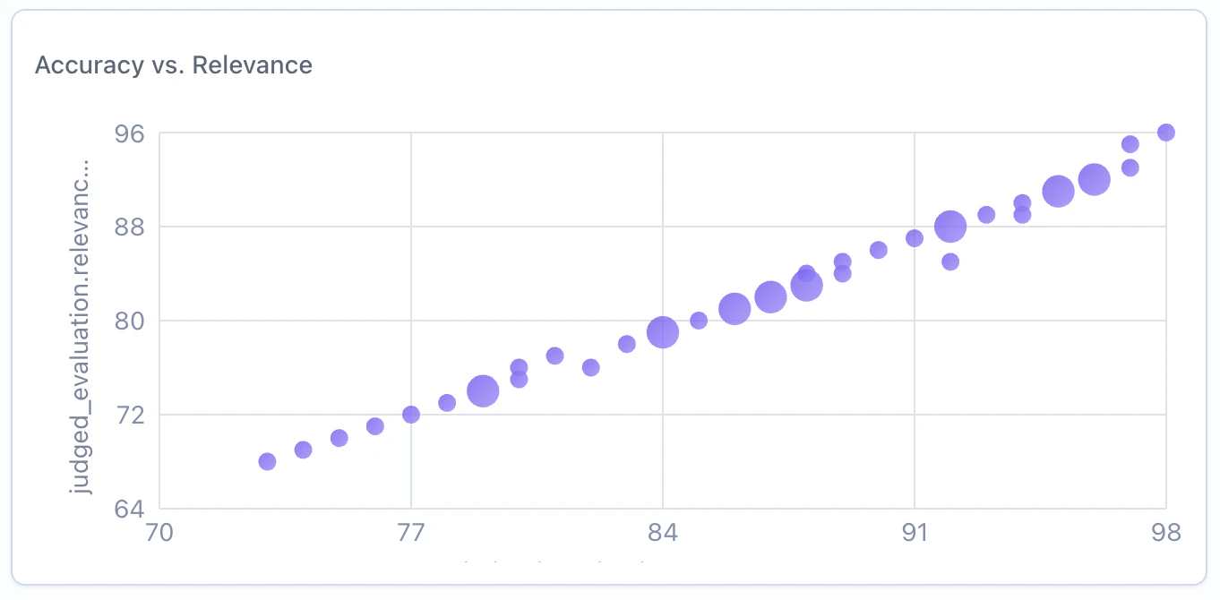
### Use Case 1: Accuracy vs. Relevance Scores
Explore the relationship between accuracy and relevance across evaluation items.
```python Python theme={null}
widget = client.evaluation_dashboards.widgets.create(
dashboard_id=dashboard.id,
title="Accuracy vs. Relevance",
type="scatter",
query={
"select": [
{
"expression": {
"type": "COLUMN",
"column": "accuracy_score",
"source": "data"
}
},
{
"expression": {
"type": "COLUMN",
"column": "relevance_score",
"source": "data"
}
}
]
},
config={
"x_column": "accuracy_score"
}
)
```
```json JSON theme={null}
{
"title": "Accuracy vs. Relevance",
"type": "scatter",
"query": {
"select": [
{"expression": {"type": "COLUMN", "column": "accuracy_score", "source": "data"}},
{"expression": {"type": "COLUMN", "column": "relevance_score", "source": "data"}}
]
},
"config": {
"x_column": "accuracy_score"
}
}
```
***
### Use Case 2: Overall Score vs. Response Length
Explore whether longer responses correlate with higher or lower scores.
```python Python theme={null}
widget = client.evaluation_dashboards.widgets.create(
dashboard_id=dashboard.id,
title="Overall Score vs. Response Length",
type="scatter",
query={
"select": [
{
"expression": {
"type": "COLUMN",
"column": "overall_score",
"source": "data"
}
},
{
"expression": {
"type": "COLUMN",
"column": "response_length",
"source": "data"
}
}
]
},
config={
"x_column": "overall_score"
}
)
```
```json JSON theme={null}
{
"title": "Overall Score vs. Response Length",
"type": "scatter",
"query": {
"select": [
{"expression": {"type": "COLUMN", "column": "overall_score", "source": "data"}},
{"expression": {"type": "COLUMN", "column": "response_length", "source": "data"}}
]
},
"config": {
"x_column": "overall_score"
}
}
```
## Related Documentation
* [Bar Chart Widget](./bar) - For categorical comparisons
* [Histogram Widget](./histogram) - For distribution visualization
* [Query Language](../query-language) - Filter and aggregation syntax
* [API Reference](/reference/v5/evaluation-dashboards) - Programmatic chart creation
* **X-Axis**: Select the numeric column for the horizontal axis
* **Y-Axis**: The remaining numeric columns become the y-axis values
* **Group By**: Optionally group data points by a categorical dimension
* **Filter**: Add conditions to narrow the data (optional)
Click "Add" to generate the scatter plot
## Output Format
Scatter plot widgets return row data for each point:
```json theme={null}
{
"type": "series",
"data": [
{"accuracy_score": 92, "relevance_score": 85, "count": 5},
{"accuracy_score": 78, "relevance_score": 91, "count": 3},
{"accuracy_score": 88, "relevance_score": 82, "count": 7}
]
}
```
Each data point represents a dot on the scatter plot. When grouped, the aggregation value determines both the position and the dot size.
## Example Use Cases
### Use Case 1: Accuracy vs. Relevance Scores
Explore the relationship between accuracy and relevance across evaluation items.
```python Python theme={null}
widget = client.evaluation_dashboards.widgets.create(
dashboard_id=dashboard.id,
title="Accuracy vs. Relevance",
type="scatter",
query={
"select": [
{
"expression": {
"type": "COLUMN",
"column": "accuracy_score",
"source": "data"
}
},
{
"expression": {
"type": "COLUMN",
"column": "relevance_score",
"source": "data"
}
}
]
},
config={
"x_column": "accuracy_score"
}
)
```
```json JSON theme={null}
{
"title": "Accuracy vs. Relevance",
"type": "scatter",
"query": {
"select": [
{"expression": {"type": "COLUMN", "column": "accuracy_score", "source": "data"}},
{"expression": {"type": "COLUMN", "column": "relevance_score", "source": "data"}}
]
},
"config": {
"x_column": "accuracy_score"
}
}
```
***
### Use Case 2: Overall Score vs. Response Length
Explore whether longer responses correlate with higher or lower scores.
```python Python theme={null}
widget = client.evaluation_dashboards.widgets.create(
dashboard_id=dashboard.id,
title="Overall Score vs. Response Length",
type="scatter",
query={
"select": [
{
"expression": {
"type": "COLUMN",
"column": "overall_score",
"source": "data"
}
},
{
"expression": {
"type": "COLUMN",
"column": "response_length",
"source": "data"
}
}
]
},
config={
"x_column": "overall_score"
}
)
```
```json JSON theme={null}
{
"title": "Overall Score vs. Response Length",
"type": "scatter",
"query": {
"select": [
{"expression": {"type": "COLUMN", "column": "overall_score", "source": "data"}},
{"expression": {"type": "COLUMN", "column": "response_length", "source": "data"}}
]
},
"config": {
"x_column": "overall_score"
}
}
```
## Related Documentation
* [Bar Chart Widget](./bar) - For categorical comparisons
* [Histogram Widget](./histogram) - For distribution visualization
* [Query Language](../query-language) - Filter and aggregation syntax
* [API Reference](/reference/v5/evaluation-dashboards) - Programmatic chart creation