> ## Documentation Index
> Fetch the complete documentation index at: https://docs.gp.scale.com/llms.txt
> Use this file to discover all available pages before exploring further.
# Histogram Widget
> Visualize data distributions across numerical ranges
**Using Sample Data**: The examples on this page use fields from our sample dataset. Download it and create an evaluation with it to follow along with this tutorial.
 ## When to Use
Use histogram widgets to:
* Show value distributions (groups data by distinct values)
* Visualize frequency counts or aggregated metrics
* Identify patterns in numerical data
* Display aggregated data in a distribution format
## Configuration
### Required Fields
Widget display name shown on the dashboard
Must be set to "histogram"
SeriesQuery selecting the column
### X-Axis Configuration (One Required)
You must provide **either** `x_column` **or** `x_column_group`, but not both:
Single column name to group by for the x-axis. The histogram displays distinct values from this column.
**Example:** `"overall_score"` - groups by each score value (75, 80, 85, etc.)
Array of column names for multi-dimensional grouping. Creates separate distributions for each combination.
**Example:** `["agent_name"]` - creates separate distributions for each agent
**Note:** Multi-dimensional grouping creates overlaid or stacked distributions for comparison.
### Optional Config Fields
Controls whether multiple distributions are stacked or overlaid.
* `true` (default): Stack distributions on top of each other
* `false`: Overlay distributions for easier comparison
When `true`, each bar's value is rendered directly on the chart so you don't have to hover to read it.
Value labels apply to single-series histograms only (those with one aggregation). They are ignored on multi-series histograms, which use a legend instead.
### Query Requirements
Histogram widgets require a **SeriesQuery** with:
* Select the column you want to group by (becomes the x-axis)
* Can include aggregations (`COUNT`, `SUM`, `AVG`, etc.) for the y-axis
* If no aggregation is specified, `COUNT` is used by default
* Can include `filter` to narrow the dataset
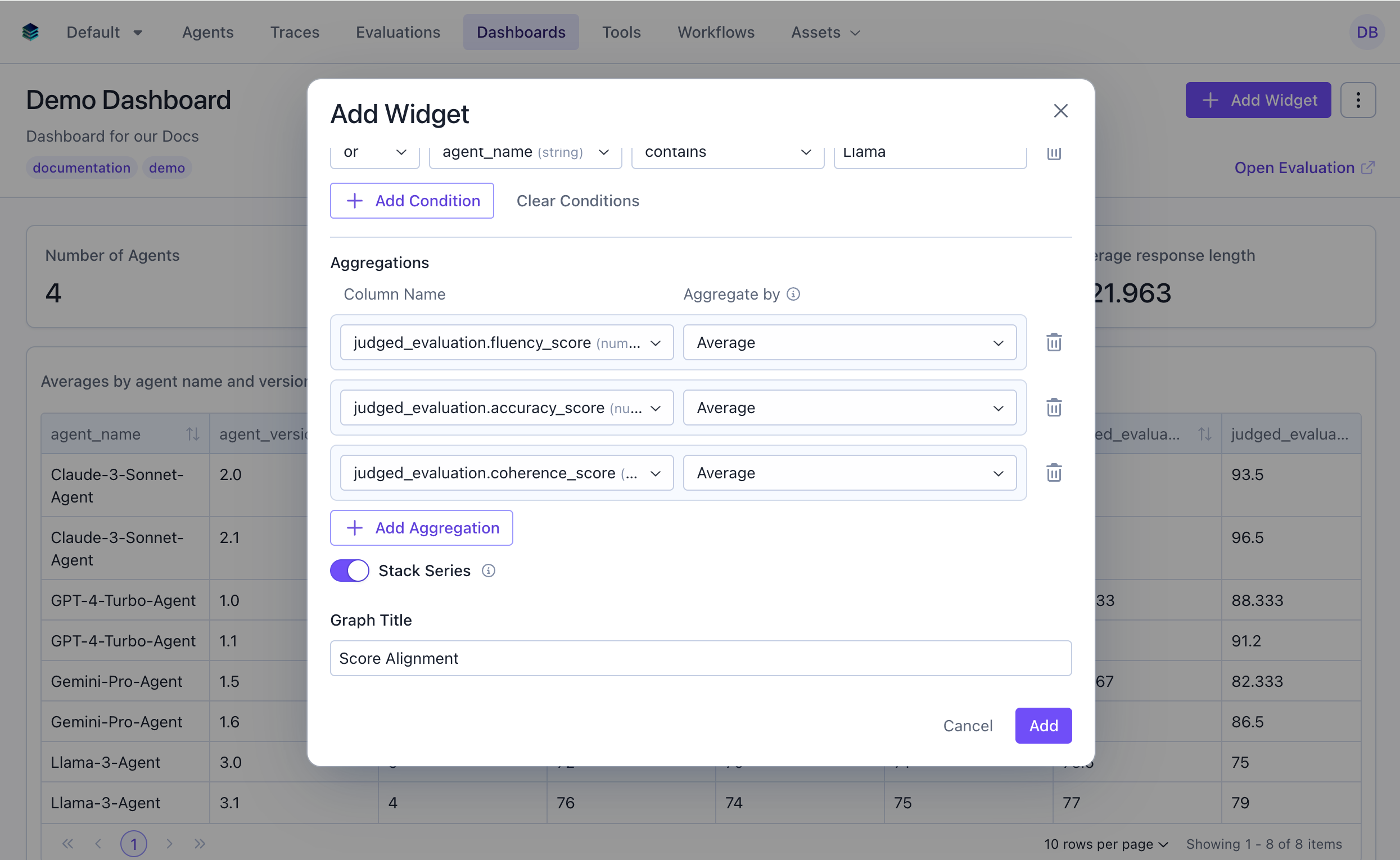
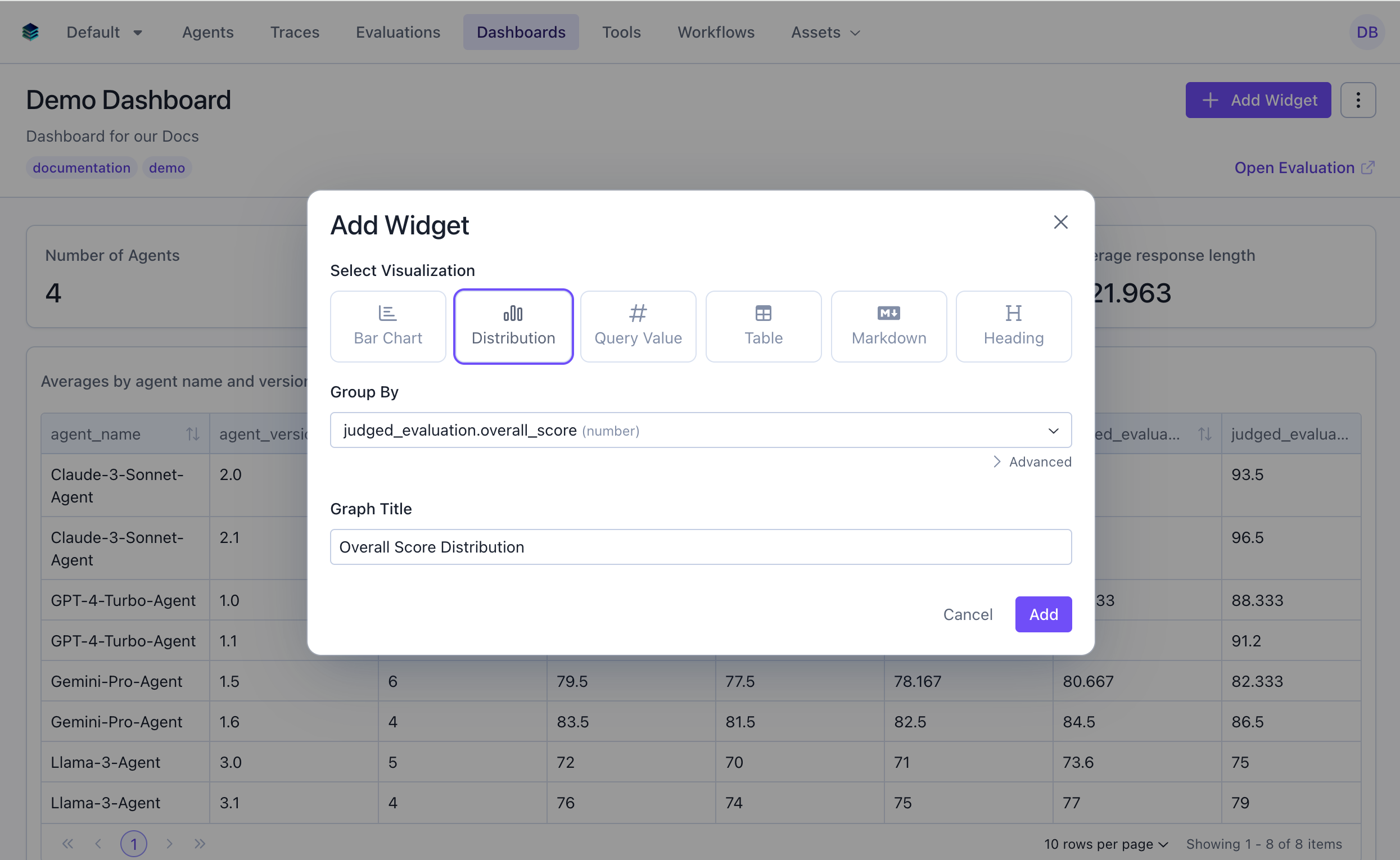
## Creating in the UI
From your dashboard, click "Add Widget" and select "Histogram"
Give your histogram a descriptive name (e.g., "Score Distribution")
Choose the column to group by (this will be the x-axis)
## When to Use
Use histogram widgets to:
* Show value distributions (groups data by distinct values)
* Visualize frequency counts or aggregated metrics
* Identify patterns in numerical data
* Display aggregated data in a distribution format
## Configuration
### Required Fields
Widget display name shown on the dashboard
Must be set to "histogram"
SeriesQuery selecting the column
### X-Axis Configuration (One Required)
You must provide **either** `x_column` **or** `x_column_group`, but not both:
Single column name to group by for the x-axis. The histogram displays distinct values from this column.
**Example:** `"overall_score"` - groups by each score value (75, 80, 85, etc.)
Array of column names for multi-dimensional grouping. Creates separate distributions for each combination.
**Example:** `["agent_name"]` - creates separate distributions for each agent
**Note:** Multi-dimensional grouping creates overlaid or stacked distributions for comparison.
### Optional Config Fields
Controls whether multiple distributions are stacked or overlaid.
* `true` (default): Stack distributions on top of each other
* `false`: Overlay distributions for easier comparison
When `true`, each bar's value is rendered directly on the chart so you don't have to hover to read it.
Value labels apply to single-series histograms only (those with one aggregation). They are ignored on multi-series histograms, which use a legend instead.
### Query Requirements
Histogram widgets require a **SeriesQuery** with:
* Select the column you want to group by (becomes the x-axis)
* Can include aggregations (`COUNT`, `SUM`, `AVG`, etc.) for the y-axis
* If no aggregation is specified, `COUNT` is used by default
* Can include `filter` to narrow the dataset
## Creating in the UI
From your dashboard, click "Add Widget" and select "Histogram"
Give your histogram a descriptive name (e.g., "Score Distribution")
Choose the column to group by (this will be the x-axis)
 Add aggregations for the y-axis. If none specified, `COUNT` is used by default.
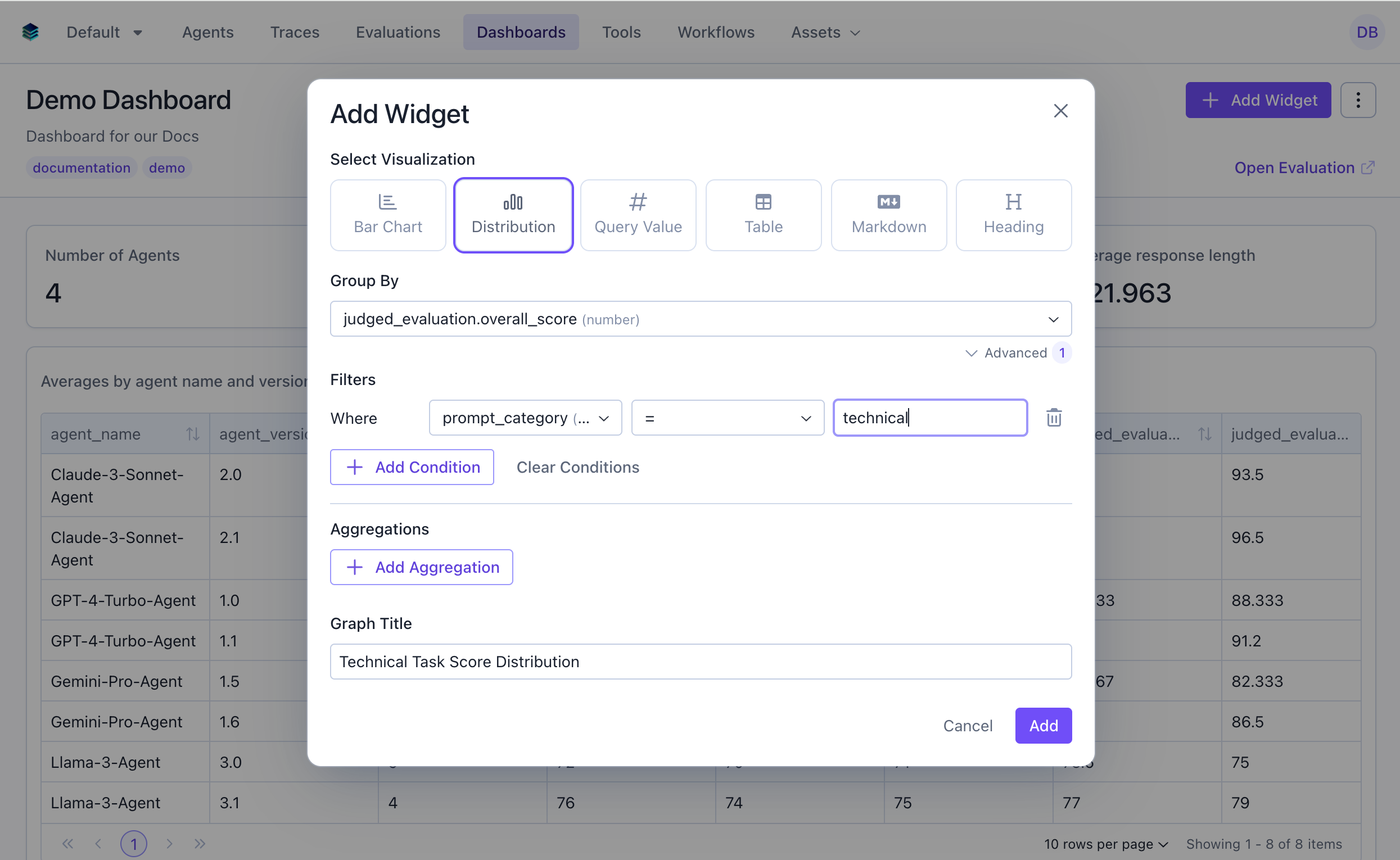
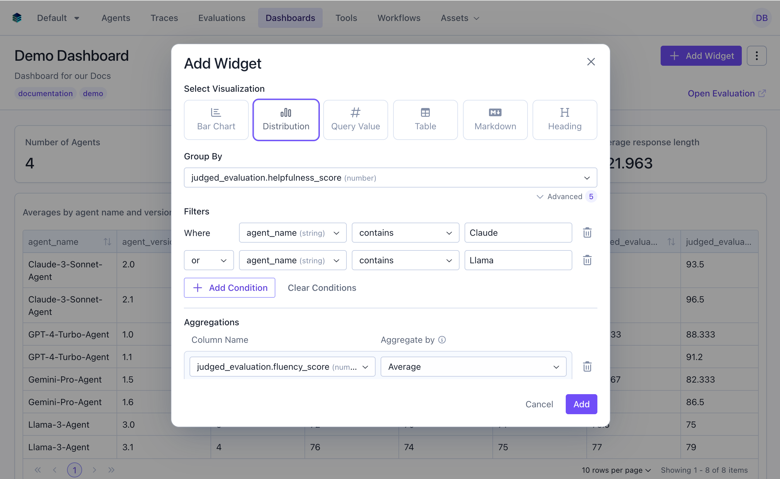 Optionally filter to specific subsets of data
For single-series histograms, toggle **Show values on bars** to render each bar's value directly on the chart. This sets `config.show_value_labels`.
Click "Add" to generate the histogram
Optionally filter to specific subsets of data
For single-series histograms, toggle **Show values on bars** to render each bar's value directly on the chart. This sets `config.show_value_labels`.
Click "Add" to generate the histogram
 ## Output Format
Histogram widgets return grouped data:
```json theme={null}
{
"type": "series",
"data": [
{"score": 75, "count": 12},
{"score": 80, "count": 45},
{"score": 85, "count": 89},
{"score": 90, "count": 156},
...
]
}
```
Each data point represents a distinct value from the grouped column and its corresponding count or aggregated metric.
## Example Use Cases
### Use Case 1: Overall Score Distribution
Visualize how overall scores are distributed across all evaluations. This will by default show the count of evaluations for each score value.
## Output Format
Histogram widgets return grouped data:
```json theme={null}
{
"type": "series",
"data": [
{"score": 75, "count": 12},
{"score": 80, "count": 45},
{"score": 85, "count": 89},
{"score": 90, "count": 156},
...
]
}
```
Each data point represents a distinct value from the grouped column and its corresponding count or aggregated metric.
## Example Use Cases
### Use Case 1: Overall Score Distribution
Visualize how overall scores are distributed across all evaluations. This will by default show the count of evaluations for each score value.
 ```python Python theme={null}
widget = client.evaluation_dashboards.widgets.create(
dashboard_id=dashboard.id,
title="Overall Score Distribution",
type="histogram",
query={
"select": [
{
"expression": {
"type": "COLUMN",
"column": "overall_score",
"source": "data"
}
},
{"expression": {"type": "AGGREGATION", "function": "COUNT", "column": "*"}}
]
"groupBy": ["overall_score"]
},
config={
"x_column": "overall_score"
}
)
```
```json JSON theme={null}
{
"title": "Overall Score Distribution",
"type": "histogram",
"query": {
"select": [
{
"expression": {
"type": "COLUMN",
"column": "overall_score",
"source": "data"
}
},
{"expression": {"type": "AGGREGATION", "function": "COUNT", "column": "*"}}
],
"groupBy": ["overall_score"]
},
"config": {
"x_column": "overall_score"
}
}
```
***
### Use Case 2: Technical Task Score Distribution
Show distribution for evaluations in the technical category only.
```python Python theme={null}
widget = client.evaluation_dashboards.widgets.create(
dashboard_id=dashboard.id,
title="Overall Score Distribution",
type="histogram",
query={
"select": [
{
"expression": {
"type": "COLUMN",
"column": "overall_score",
"source": "data"
}
},
{"expression": {"type": "AGGREGATION", "function": "COUNT", "column": "*"}}
]
"groupBy": ["overall_score"]
},
config={
"x_column": "overall_score"
}
)
```
```json JSON theme={null}
{
"title": "Overall Score Distribution",
"type": "histogram",
"query": {
"select": [
{
"expression": {
"type": "COLUMN",
"column": "overall_score",
"source": "data"
}
},
{"expression": {"type": "AGGREGATION", "function": "COUNT", "column": "*"}}
],
"groupBy": ["overall_score"]
},
"config": {
"x_column": "overall_score"
}
}
```
***
### Use Case 2: Technical Task Score Distribution
Show distribution for evaluations in the technical category only.
 ```python Python theme={null}
widget = client.evaluation_dashboards.widgets.create(
dashboard_id=dashboard.id,
title="Technical Task Score Distribution",
type="histogram",
query={
"select": [
{"expression": {"type": "COLUMN", "column": "overall_score", "source": "data"}},
{"expression": {"type": "AGGREGATION", "function": "COUNT", "column": "*"}}
],
"filter": {
"conditions": [
{"column": "prompt_category", "source": "data", "operator": "=", "value": "technical"}
]
},
"groupBy": ["overall_score"]
},
config={"x_column": "overall_score"}
)
```
```json JSON theme={null}
{
"title": "Technical Task Score Distribution",
"type": "histogram",
"query": {
"select": [
{"expression": {"type": "COLUMN", "column": "overall_score", "source": "data"}},
{"expression": {"type": "AGGREGATION", "function": "COUNT", "column": "*"}}
],
"filter": {
"conditions": [
{"column": "prompt_category", "source": "data", "operator": "=", "value": "technical"}
]
},
"groupBy": ["overall_score"]
},
"config": {
"x_column": "overall_score"
}
}
```
***
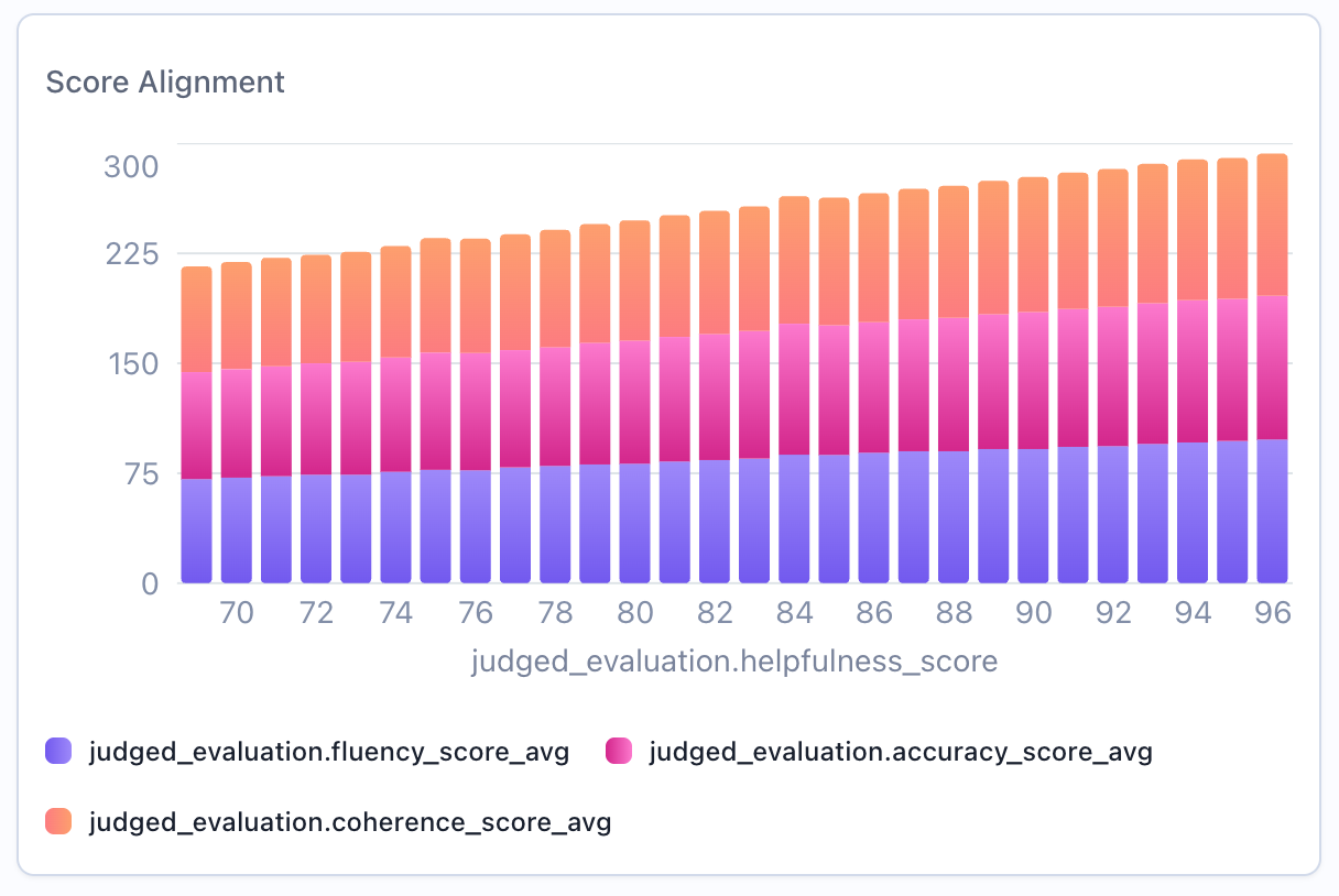
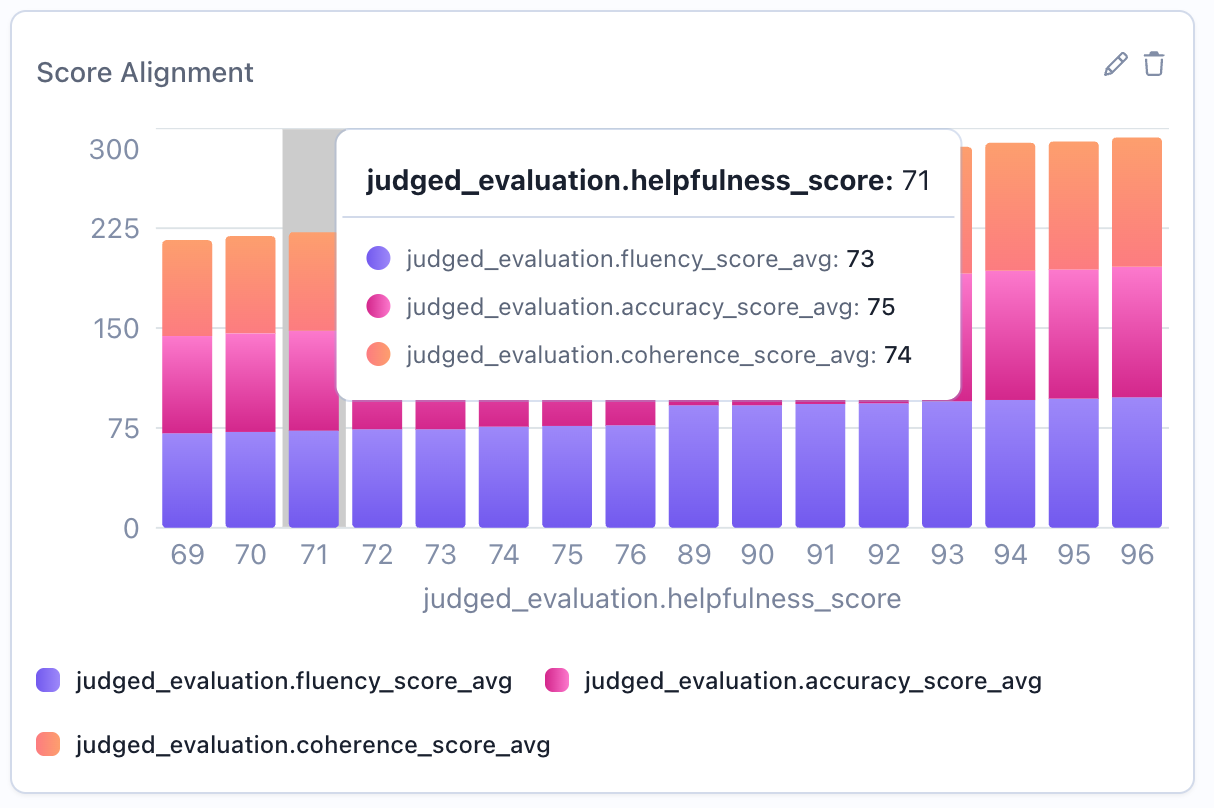
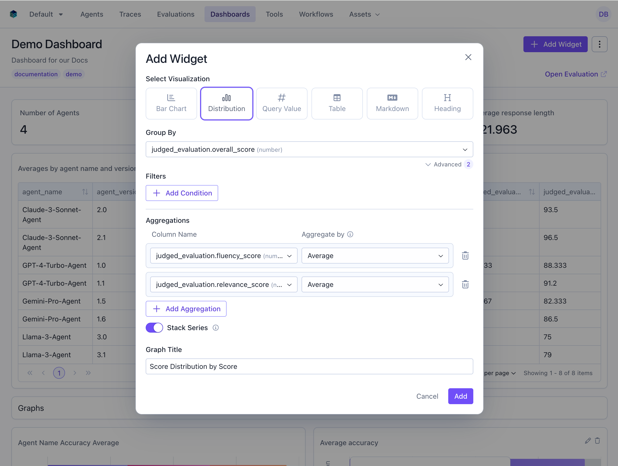
### Use Case 3: Comparing Distributions Across Categories
Create overlaid histograms to compare score distributions across different scores.
```python Python theme={null}
widget = client.evaluation_dashboards.widgets.create(
dashboard_id=dashboard.id,
title="Technical Task Score Distribution",
type="histogram",
query={
"select": [
{"expression": {"type": "COLUMN", "column": "overall_score", "source": "data"}},
{"expression": {"type": "AGGREGATION", "function": "COUNT", "column": "*"}}
],
"filter": {
"conditions": [
{"column": "prompt_category", "source": "data", "operator": "=", "value": "technical"}
]
},
"groupBy": ["overall_score"]
},
config={"x_column": "overall_score"}
)
```
```json JSON theme={null}
{
"title": "Technical Task Score Distribution",
"type": "histogram",
"query": {
"select": [
{"expression": {"type": "COLUMN", "column": "overall_score", "source": "data"}},
{"expression": {"type": "AGGREGATION", "function": "COUNT", "column": "*"}}
],
"filter": {
"conditions": [
{"column": "prompt_category", "source": "data", "operator": "=", "value": "technical"}
]
},
"groupBy": ["overall_score"]
},
"config": {
"x_column": "overall_score"
}
}
```
***
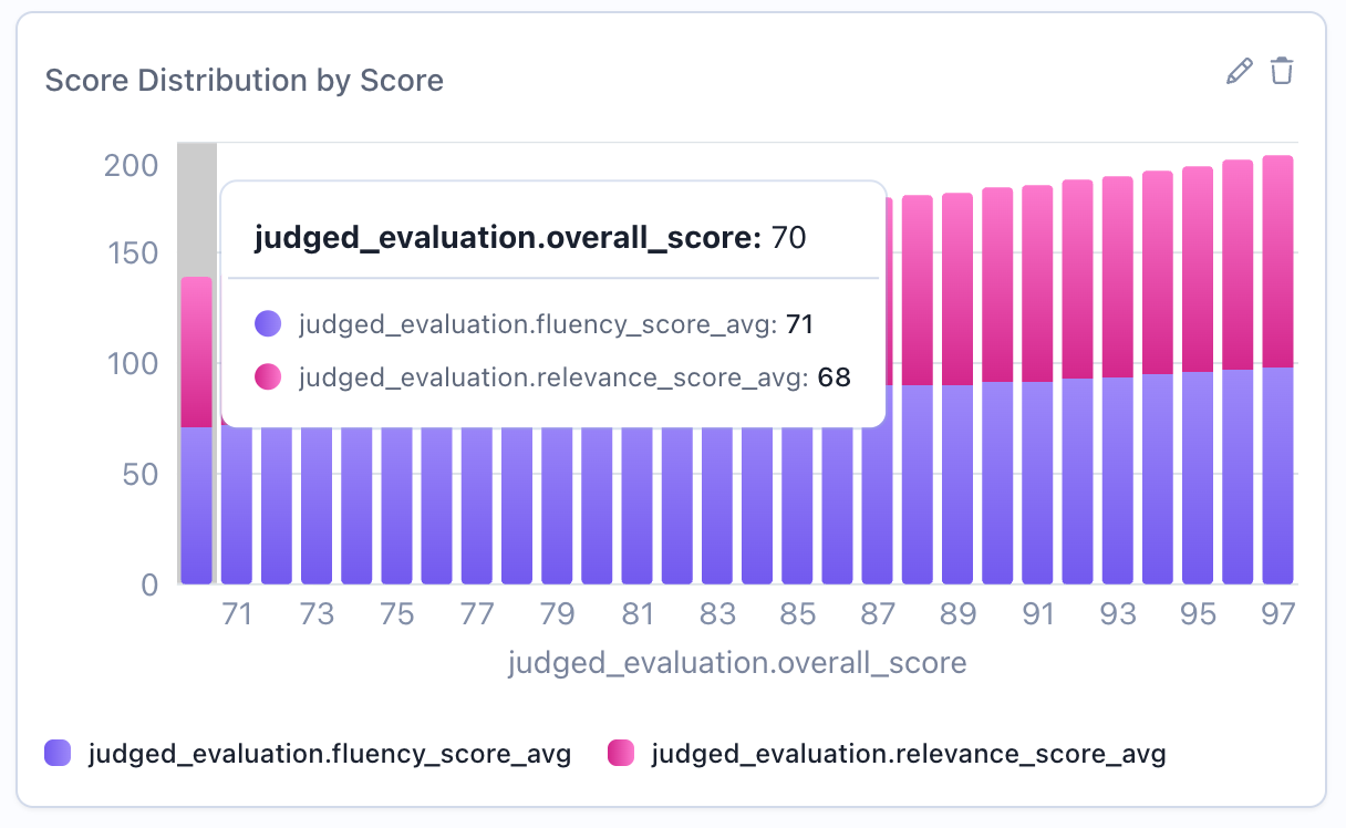
### Use Case 3: Comparing Distributions Across Categories
Create overlaid histograms to compare score distributions across different scores.
 ```python Python theme={null}
widget = client.evaluation_dashboards.widgets.create(
dashboard_id=dashboard.id,
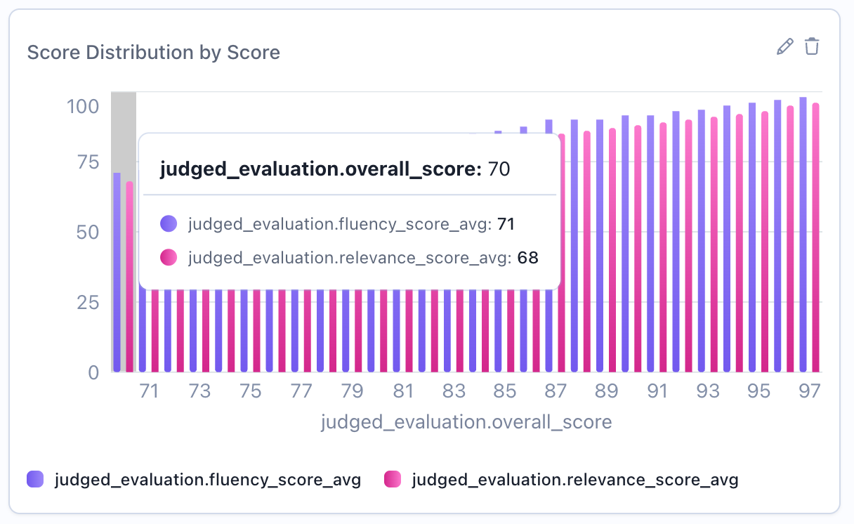
title="Score Distribution by Score",
type="histogram",
query={
"select": [
{"expression": {"type": "COLUMN", "column": "overall_score", "source": "data"}},
{"expression": {"type": "AGGREGATION", "function": "AVG", "column": "fluency_score", "source": "data"}},
{"expression": {"type": "AGGREGATION", "function": "AVG", "column": "relevance_score", "source": "data"}}
],
"groupBy": ["overall_score"]
},
config={
"x_column": "overall_score",
"stacked": True
}
)
```
```json JSON theme={null}
{
"title": "Score Distribution by Score",
"type": "histogram",
"query": {
"select": [
{"expression": {"type": "COLUMN", "column": "agent_name", "source": "data"}},
{"expression": {"type": "AGGREGATION", "function": "AVG", "column": "fluency_score", "source": "data"}},
{"expression": {"type": "AGGREGATION", "function": "AVG", "column": "relevance_score", "source": "data"}}
],
"groupBy": ["overall_score"]
},
"config": {
"x_column": "overall_score",
"stacked": true
}
}
```
## Stacked vs Overlaid Distributions
When comparing distributions across groups, you can control visualization style:
### Overlaid Distributions (Unstacked)
```python Python theme={null}
widget = client.evaluation_dashboards.widgets.create(
dashboard_id=dashboard.id,
title="Score Distribution by Score",
type="histogram",
query={
"select": [
{"expression": {"type": "COLUMN", "column": "overall_score", "source": "data"}},
{"expression": {"type": "AGGREGATION", "function": "AVG", "column": "fluency_score", "source": "data"}},
{"expression": {"type": "AGGREGATION", "function": "AVG", "column": "relevance_score", "source": "data"}}
],
"groupBy": ["overall_score"]
},
config={
"x_column": "overall_score",
"stacked": True
}
)
```
```json JSON theme={null}
{
"title": "Score Distribution by Score",
"type": "histogram",
"query": {
"select": [
{"expression": {"type": "COLUMN", "column": "agent_name", "source": "data"}},
{"expression": {"type": "AGGREGATION", "function": "AVG", "column": "fluency_score", "source": "data"}},
{"expression": {"type": "AGGREGATION", "function": "AVG", "column": "relevance_score", "source": "data"}}
],
"groupBy": ["overall_score"]
},
"config": {
"x_column": "overall_score",
"stacked": true
}
}
```
## Stacked vs Overlaid Distributions
When comparing distributions across groups, you can control visualization style:
### Overlaid Distributions (Unstacked)
 Multiple distributions shown with transparency, overlapping each other. Best for:
* Comparing distribution shapes directly
* Identifying differences in peaks and spread
* Seeing all distributions simultaneously
```python theme={null}
config={"x_column": "overall_score", "stacked": False}
```
### Stacked Distributions
Multiple distributions shown with transparency, overlapping each other. Best for:
* Comparing distribution shapes directly
* Identifying differences in peaks and spread
* Seeing all distributions simultaneously
```python theme={null}
config={"x_column": "overall_score", "stacked": False}
```
### Stacked Distributions
 Distributions stacked vertically to show combined totals. Best for:
* Showing total counts across all groups
* Part-to-whole relationships
* When cumulative view is meaningful
```python theme={null}
config={"x_column": "overall_score", "stacked": True} # Default
```
## Display Behavior
Histograms apply the following formatting automatically. These behaviors are built into the rendering, so there are no extra config fields to set.
### Per-category colors
When a histogram has a single series and more than one bucket, each bar is given a distinct color from a rotating palette, making individual buckets easier to tell apart. Histograms with multiple series keep one consistent color per series instead, so the series stay comparable across buckets.
### Humanized column names
Raw column names are converted to readable Title Case in axis labels, the legend, and tooltips (for example, `overall_score` becomes "Overall Score"). Aliases that already contain spaces are shown unchanged, so you can override the displayed text by aliasing a column in your query.
## Related Documentation
* [Bar Chart Widget](./bar) - For categorical distributions
* [Metric Widget](./metric) - Show percentiles and statistical measures
* [Table Widget](./table) - Detailed numerical breakdowns
* [Query Language](../query-language) - Filter and column syntax
Distributions stacked vertically to show combined totals. Best for:
* Showing total counts across all groups
* Part-to-whole relationships
* When cumulative view is meaningful
```python theme={null}
config={"x_column": "overall_score", "stacked": True} # Default
```
## Display Behavior
Histograms apply the following formatting automatically. These behaviors are built into the rendering, so there are no extra config fields to set.
### Per-category colors
When a histogram has a single series and more than one bucket, each bar is given a distinct color from a rotating palette, making individual buckets easier to tell apart. Histograms with multiple series keep one consistent color per series instead, so the series stay comparable across buckets.
### Humanized column names
Raw column names are converted to readable Title Case in axis labels, the legend, and tooltips (for example, `overall_score` becomes "Overall Score"). Aliases that already contain spaces are shown unchanged, so you can override the displayed text by aliasing a column in your query.
## Related Documentation
* [Bar Chart Widget](./bar) - For categorical distributions
* [Metric Widget](./metric) - Show percentiles and statistical measures
* [Table Widget](./table) - Detailed numerical breakdowns
* [Query Language](../query-language) - Filter and column syntax